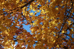
Balance
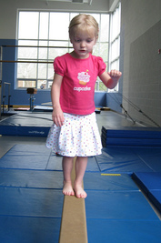
Balance is the amount of visual weight on objects. I chose this picture because i think it has the right amount of balance.
Balance
i chose this because it was equally proportioned.
Emphasis
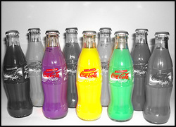
The part of the design that catches the viewers eye. I chose this because the three colored coca-colas caught my eye.
Emphasis
i chose this because the red stands out.
Harmony
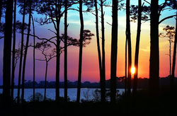
The nice effect of applying like colors . I chose this picture because it is peaceful and all the colors go extremely well together.
Harmony
I chose this because the colors look very nice and they're applying like colors.
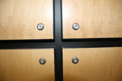
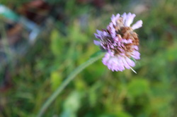
Contrast
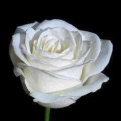
The happening of different elements that catches the viewers attention to the focus. I chose this picture because my focus went automatically to the flower.
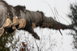
Contrast
I chose this because i immediately saw the dark wood.
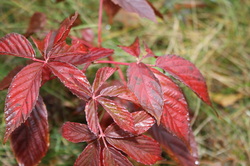
Proportion
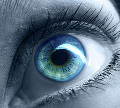
To make something look more important than another. I chose this picture because the center of the eye stands out most.
Proportion
The flower looks more important than the rest.
